The (Front) Matter at Hand

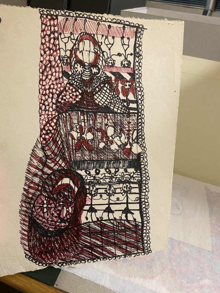
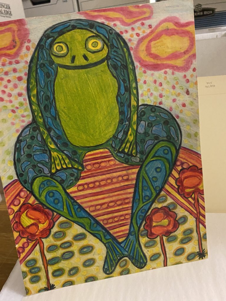
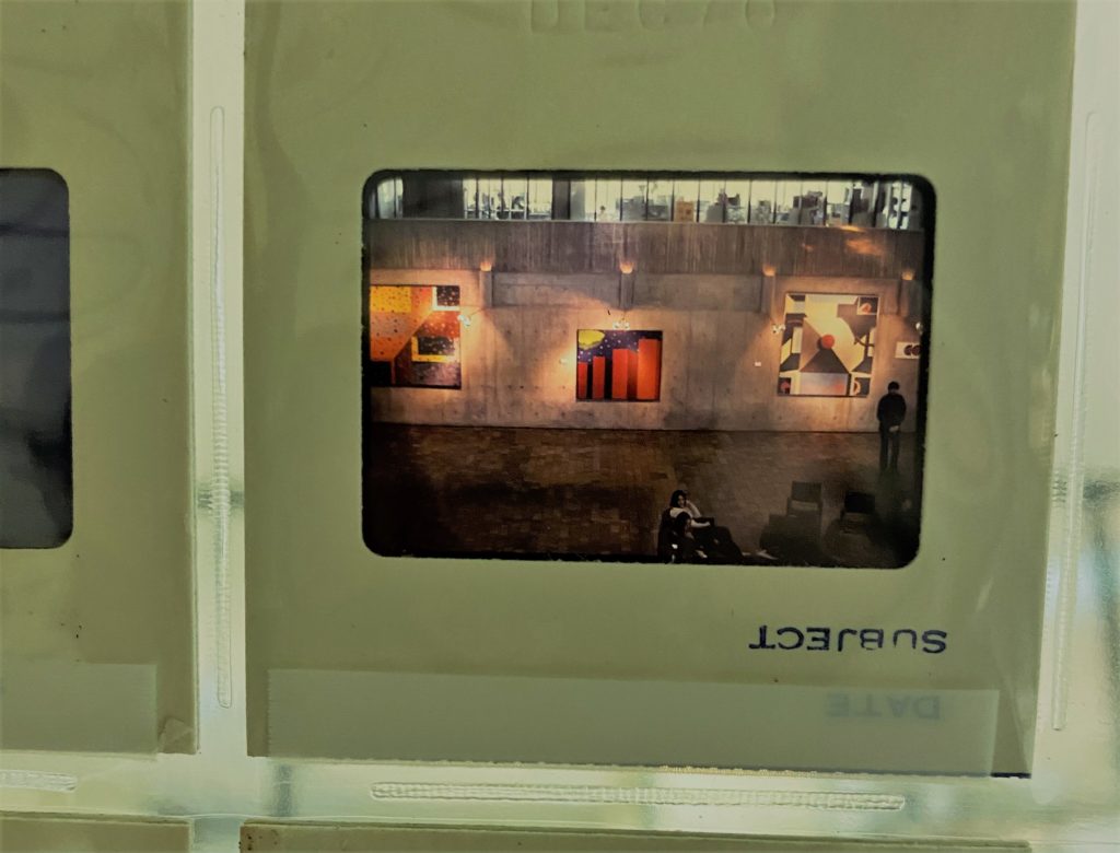
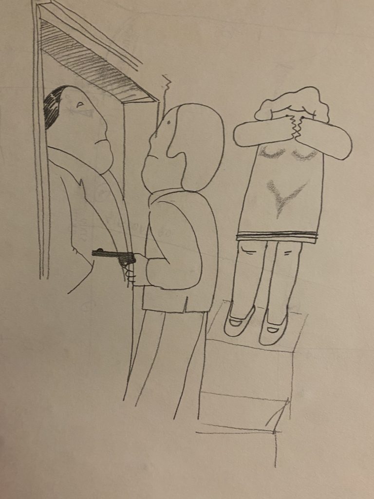
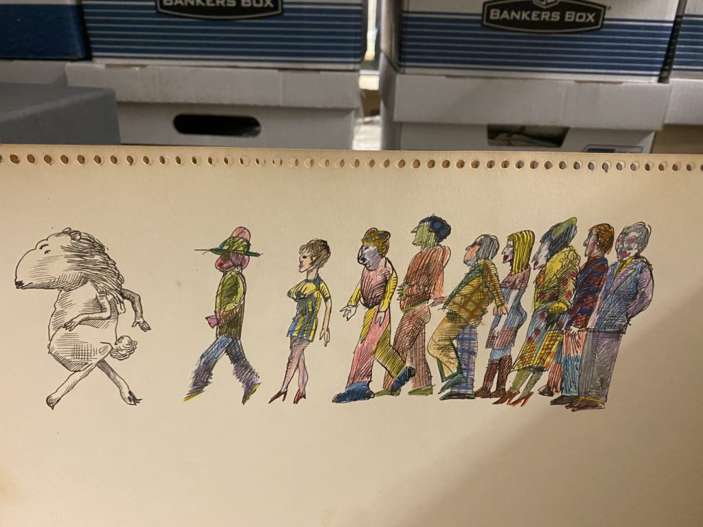
This week entailed the end of processing Annette’s total items. Spiral bound sketchbooks were carefully separated and each page was preserved with interwoven tissue paper to uphold the use of color integrity. One sketchbook, that was not spiral bound but was actually bound more like a traditional book, instead had each page separated by a piece of tissue paper in between to protect the illustrative integrity. When looking through the sketchbooks it became even more apparent to me why Annette had chosen to be an artist as a career, there were various styles represented and each of them was attended to with great care. The sketches ranged from cartoonish with a slight edge to life-like abstractions of the human form that really made the viewer (me) think. Her range echoed her simultaneous fastidious attention to detail and her confidence in not being bothered to be confined to a particular style.

Next week I will put the finishing touches on Annette’s collection by double checking what I’ve inventoried and numbering boxes and folders accordingly. Subsequently, it will be time to work on the front matter! In the front matter I will be assessing things like the abstract of the collection, inclusive dates, some biographical information on Annette to include for researchers and the scope of the collection. I look forward to summarizing what I have found in Annette’s collection, though words will not do it justice, it’s truly a collection one has to see for themselves. I encourage anyone with an interest in textiles as a medium for abstract art to take a look at this collection in some capacity, the knowledge extended posthumously by Annette is very much worth gaining.

Contours of Impression; Cartographies of Knowledge

I tend to dwell on the content of the maps. But today I had a revelation, one that may have a more of an impact on my archival efforts down the line. Today, I wondered about the sport, perhaps, or rather the technologies of the actual mapmaking. How are the prints differing? What are the processes and stylings of cartographic practice? I imagine their production is important for collectors. Somehow it was not for me until today. Maybe this was a form over function thing all along. In fact, if it wasn’t for the overwhelming focus on South America–particularly the Strait of Magellan–I would really question if I made a serious error in not recording the maps’ typology in this auditing process. Luckily, ancillary material indicates that my focus on the content is the correct approach to this.

But in that brief anxious episode, I went exploring. I wanted to chart mapmaking in the era of these maps’ production. The 18th century signaled a period shift in mapmaking. Gone were the salacious mermaids, fanged whales lunging out at hapless sailors, reptilian figures lurching over the shoulder of an unknown island spraying fire from their nose. Factuality was fore; flair to the cartouche and border. This was the beginning of Enlightenment remember. Maps served science. Everything did.

With industrialization dawning, technologies proliferated and cartographers gained access to more and more tools and skills. They had telescopes and this thing called a chronometer that would chart more accurately ones positions longitudinally. Most importantly though, came the beloved survey, a technique deployed all across Europe’s most stately nation-states. The precision of data becomes the veritable counters of knowledge production industrialized, manufactured to scale.

Derived from military practices, cartography remained highly specialized–if not even more. Technical planning of the maps involved choice of a counter interval (elevation separating contour lines, lines of constant elevation). Mapping step sequences, or operational phases, were determined by the most efficient technical procedures. A guide copy printed on several sheets of plastic coated with an opaque paint, usually yellow, imprinted these counters to be prepared for the negative engraving or scribing process. The scriber follows copy on the respective plates by engraving through the coating as an arc light can only pass through engraving scratches, which become the negatives for press plates.

Most finite lines, matrices, upon more grids of lines, some of which are 0.002 inches, or 0.05 millimeters wide, are intermediate contours engraved freehand. Yet heavier lines, the index contours engraved at 0.007 inch, required small tripods for perfect verticality. Boundaries and shorelines printed and etched on coated sheets, areas of woodland or water peeled off, leaving open windows for features. There, character can peek through the lines.

Despite these maps’ precision and multifarious means of production, only on a globe can maps retain fidelity. Maps, projected onto a flat surface as a method of production contain inevitable distortions. By light, impressions are guided by the choice of the engraver. With distortions comes perspective. What is my perspective? Perhaps its gnomonic, stereographic, or orthographic. I consider my projections in interpreting the material. I consider the contours of my impression of it. Archiving is a technology. All this psychodynamic cartography going on in the process of my task.

By Thine Own Hand

After a week filled with presentations and module 1 finals at CGU it was cathartic to be able to sit down with Annette’s collection again. This week all of her photographs were sorted and archived to completion and I began to embark on Annette’s sketchbooks, each seemingly with their own voice. In the photographs I came across photos of Annette’s commissioned textile work displayed in a lobby, using contextual clues from the other photos in the collection it appears to have been taken somewhere between the late 60’s and early 70’s. It wasn’t the natural warm tone of the film that caught my eye, or the soft pixelated grain characteristic of the epoch, it was the sliver of a bare window in the foreground that looked onto a sunny city street. Through this sliver one could make out light stone buildings that looked new despite their art deco features and wide boxy cars dotted the streets in front. Annette had such a keen eye even the faint background of her photos are interesting. At the time of this photo the president could have been Johnson, Nixon or Ford, maybe even my favorite President Carter, and it made me think about how things must have changed and how others had stayed the same.

In her sketchbooks I found a different story, these pieces weren’t necessarily reflective of a time or place like her photographs. Rather, they were timeless. One thing her sketches share with her quilts is the dedication to abstraction, which reinforces the notion that Annette saw things in her own way, on her own terms. Some of her sketches seem to have a Dali-like influence, others seem more inspired by Picasso, others seem akin to Kandinsky. However, what they all have in common is that Annette’s own originality never gets lost in translation.

Trayendo El Fuego

As I’m nearing the completion of this audit of the Drundel collection, I’m beginning to wonder if it should be called “Maps and ephemera of Tierra del Fuego and others.”

Why Tierra del Fuego? It is the first time I’ve heard of this land, but certainly not the first I’ve heard of its associations: Strait of Magellan, Patagonia, Chile, Argentina. As with really any coastal region in the fertile, precolonial South Americas, it became an immediate site of extractive enterprises. This was of no shock.

Perhaps one of the more interesting facts I learned about the island was in the nationality of the renown colonial entrepreneur in the region, Julius Popper. I’ve seen his name mentioned on a few of the maps, but hadn’t taken great note of them. Unlike most of the conquistadors, Popper was Romanian. Originally employed as a telegrapher in Chile, he set his sites on prospecting the little known metals of the island.

In the late nineteenth century, it was here he encountered the Selk’nam tribe and sponsored a genocide that lasted almost a decade. The tribe, once 4,000 individuals, were reduced to 500.

The Selk’nam were one of three tribes on Tierra del Fuego. They were hunter-gatherers and primarily situated in the northeast region, referred to as Onas by the other tribes. In the late nineteenth century, cattle farmers, gold seekers, and farmers instigated their extermination by means as brutal as deportation, hunting of members, and alcohol (Gardini, 647). “The pen hesitates to describe this systematic extermination,” writes Austrian Ethnologist Gusinde.

Gusinde himself, regarding them a “magnificent race,” was more than willing to ship their skulls to anthropological museums in Europe under the banner of science. But it was ultimately the cattle ranchers, favored by local authorities, who proposed and carried out the genocide with impunity.

Tierra del Fuego itself boasts surreal and enchanting geographical features. Each of the drawings and photos captured of the area portray a cinematic panorama without compare.

These astounding features being shaped by and characterized by the Andrean orogeny supplies a somewhat uncanny analogy to its cultural history and my role as a researcher. It is this idea of distance. I wonder often how distance can so readily lead to violence.

The name “Tierra del Fuego” derives purportedly from early conquistadors observing bonfires on the shoreline as they passed through the Strait of Magellan. The reports are that these indigenous tribes were staging an attack. What if it was a greeting? In fact, it probably had nothing to do with the colonizers at all. What if the the shore remained in shadow, never drawing the eye of the colonizers? There’s a melancholy in great events, both horrific and beatific, made probable when distance is brought to light.

Sources:

Gardini, Walter. “Restoring the Honour of an Indian Tribe-Rescate de Una Tribu.” Anthropos 79, no. 4/6 (1984): 645–47. http://www.jstor.org/stable/40461884.

Knowledge: A Map, An Island

For about 100 years, sometime after 1622, mapmakers portrayed California as an island. Among the history of cartographic errors this is always one enjoyed in US scholarship–becoming a comedic synecdoche in CA’s political history. Uniquely, and perhaps adding to the enigma of the story, the error has an origin. The culprit was Juan de la Fuca.

There is perhaps nothing entirely new in this bit of trivia. But in studying many of these maps, I am often left astounded by their detail. I fathom at the intricate and precise nature of these hand-drawn, works of art.

Without access to anything remotely similar to our cartographic technologies, how could they be done so well? I assume that many of the maps are palimpsest; or they build on a former version of the area. They are recursive. Like a sculpture fashioned over generations or by a multitude of hands, these maps arrive at a better understanding of the land through collective, historical paradox of iteration and revision.

Philosophically, this can send some into the deep end–maybe just speaking for myself. I think of simulacra in knowledge production. It seems ages and ages ago, but for over a century California was an island. That is a knowledge that would exceed my entire life. In a way, what we know, what knowledges we produce are islands. Then, over time, the map is redrawn.

Frozen in Time

This week I finished sorting all of the slides for the Thorley/Françoise collection in which I found things I did not expect. Annette had carefully and painstakingly catalogued many of her works and thus I was not surprised to see many shots of the angular manicured features of her pieces. However, I was stunned when I came across slides from Annette’s time in undergrad, complete with shots of her early work in Long Beach dating all the way back to 1964! In previous posts I mentioned her initial interest in sculpture, below you can find a carefully crafted juxtaposition between sunny 1960’s Long Beach and one of Françoise’s early pieces, an ash toned abstract sculpture seemingly approximating the female figure. I lived in Long Beach for nearly three years and to me these pictures appear to have been taken near the Long Beach marina or on the southern end of Belmont Shore. My time living in Long Beach impressed upon me the vitality of the city itself, I find solace in the memories of an entirely unpretentious and unique enclave of Los Angeles County where the southern west coast meets the Pacific Ocean. The gravitas of Annette’s sculpture pictured below is somehow the perfect complement to such a backdrop.

Similarly, Annette had a few slides collections that didn’t necessarily contain her artwork (and instead contained snapshots of personal trips), yet still retained her artistic spin. In these collections I found slides from a trip Annette took to Spain in 1971, Palmer Canyon in 1966 as well as a collection titled “Near Istanbul” (presumably Turkey) with slide dates suggesting they were taken in October of 1973. To see such places through Annette’s eyes transported me to both the time and place and created a sense of nostalgia for things I had never experienced. This speaks to Françoise’s framing ability and how she rarely captured scenes and instead opted to capture experiences and impressions. In some of her last slides I found paintings she created for a Scarborough gallery on display in 1969. You can’t quite make out the expression of the onlookers, but if I had to guess I imagine they were rightly enthralled.

An early sculpture by Annette Françoise taken during her time as an undergraduate in Long Beach