This past week, my fellow CCEPS-SURPers and I went to Denison Library at Scripps College to plan for an exhibit they will be housing in the spring. The collection at Denison has some truly impressive artwork, including a book of surreal Lear woodcuts that particularly caught my attention. Today, though, I want to show you the extra-illustrated Henley Shakespeare, which is absolutely stunning.
The Henley Shakespeare works were commissioned by Ellen Browning Scripps for publication over the first five years of the 20th century. Twenty-six copies were commissioned–one for each letter of the alphabet. Denison has “S,” for Scripps (naturally). The editions on their own are quite a sight, bound with red goatskin and featuring silk endpapers. Each book has two plays (besides the sonnets), with a portrait of one heroine each on the front and back inside covers.
But what’s most striking about these editions is, surprisingly, not the beautiful bindings, but rather the artwork that’s inside inside. Most notably, at some time in this copy’s history (we don’t know when), an unknown artist (or unknown artists) went through each play and added their own art nouveau illustrations, right on the page. Take a look at this title page for Measure for Measure:
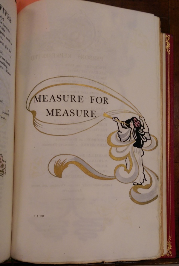
If the woman above is a character from Measure for Measure, it’s not obvious who it is–it seems to be meant more as an eye-catching embellishment. The gold painted on, found on each play’s title page and the start of many acts and scenes, is particularly attractive. Another gold-painted embellishment from this play bears mention:
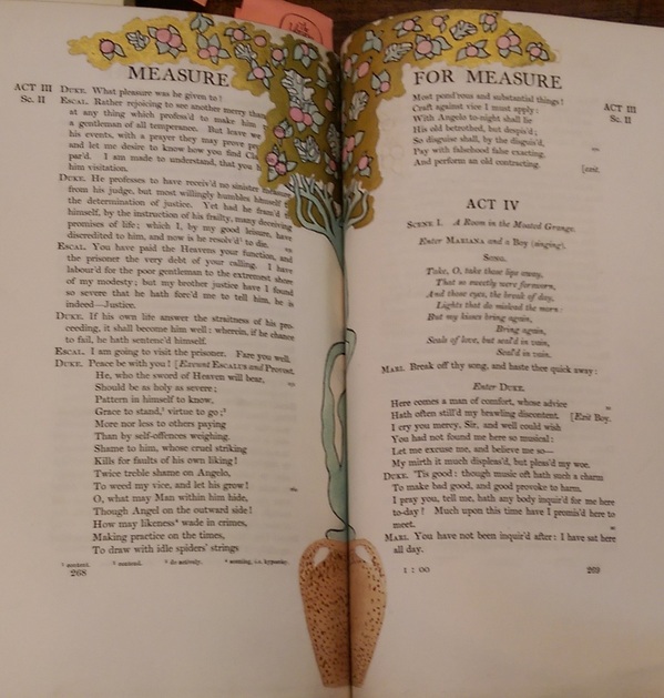
Here the artwork has quite clearly taken precedence over the text, as a number of words on the left-hand page are obscured by the opaque gold. The fact that the illustration is in the middle seam would seem to indicate that the illustrations (or at least this one) were actually drawn and painted before this copy was bound. This illustration again doesn’t seem to relate directly with the text, but I thought it was worth displaying simply for its extravagance.
Some of the other illustrations are more directly related to the scenes at hand, and are perhaps more intellectually interesting, as they constitute interpretive acts on the page itself–the artist and the playwright interacting within the text observed by the reader.
Take a look at this watercolor of Cordelia from Act I, Scene I of Lear:
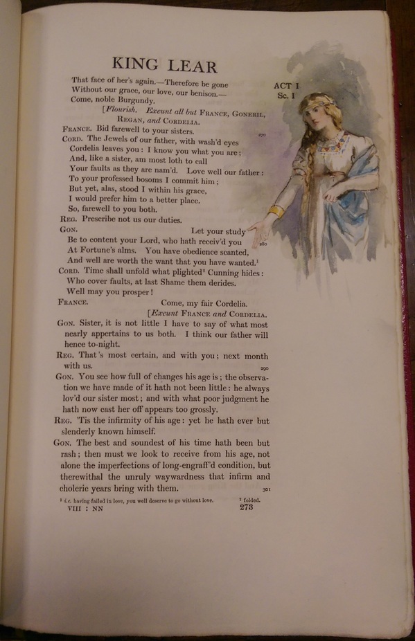
The frustration on Cordelia’s face is particularly striking. It’s not obvious which line her glare is linked with. If we take it to be an illustration from the first line, it lends a not-so-subtle sarcasm to her first farewell. Referring to her sisters as “the Jewels of our father” is certainly not a genuine line, but whether her spite is forward or veiled is a rather large difference; is Cordelia trying to call out her sisters as fakes, or is she trying to save face as she leaves by appeasing them? Either way, after the coldness of Regan and Goneril, Cordelia is by no means trying to save face; her prophecy is scathing, such that the painting could just as well illustrate her “Well may you prosper.”
I would find it more interesting if the painting were of the first line, simply because it would constitute an interpretative decision of a more ambiguous feature of the scene. The text leaves open whether Cordelia’s initial farewell is outwardly bitter or attempting sincerity; but this ambiguity cannot so easily be displayed in a realization of this text, whether on stage or in art. The ambiguity gives way to an interpretation that represents primarily one, rather than all, of the text’s possibilities.