The Irving Wallace collection is a rich resource for the study of American book publishing in the postwar decades. The series dedicated to Wallace’s 1972 novel The Word, for instance, contains five complete drafts at various stages, multiple folders of copy-editing notes, and extensive correspondence between Wallace and his editors at Simon and Schuster. These documents provide a granular picture of the intellectual labor involved in the publishing process.
Yet publishing also involves questions of design, as evidenced by this mock-up made by the production department of Simon and Schuster in 1971. While not remarkable in and of itself, this item testifies to the full spectrum of processes–from writing to editing to design to marketing–which shaped an Irving Wallace novel.
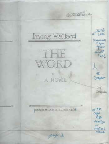
These kinds of materials also offer fertile ground for historians of popular culture, who might question the aesthetic and political values embedded in the mock-up of the title page for The Word. What might the design reveal about the author’s (and publisher’s) intended audience? Do the design elements of Wallace’s books signal challenging polemical art or safe, middle-of-the-road entertainment? And was there a gap between the outward appearance of Wallace’s novels and the content contained within?