This week, in preparation for our exhibit, I’ve been thinking more about versions. More specifically, different versions of the same thing. So today, I’ll be talking about four different versions of The Tempest. I found some pretty cool stuff in the Honnold special collections, as well as in the collection at Denison Library (Scripps College). Not only did I see beautifully illustrated editions with the unaltered text, but I even found two operas.
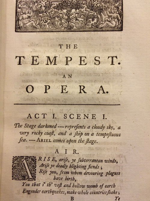
he first piece I’m going to highlight today is from 1756 and pairs down the play to three shorter acts. Most of the prose is the same, but the main difference is that the writer converted Shakespeare’s dialogue into airs to be sung.

So, as you can see here, Ariel opens the performance with a song, instead of the play opening to a ship in a storm. To me, this is just another example of Shakespeare’s transcendence across genre.
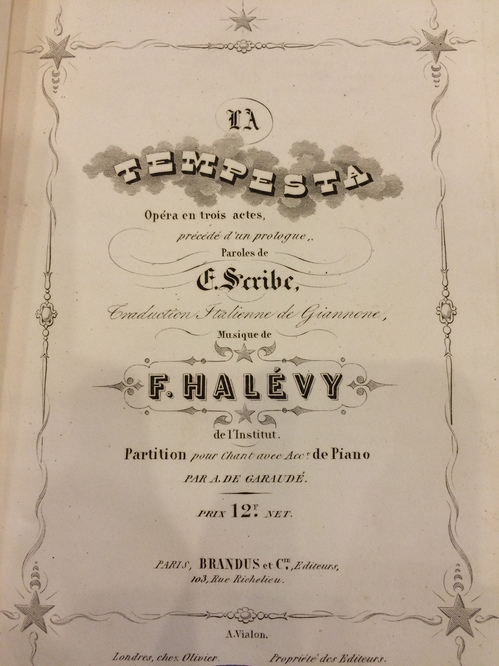
The Tempest seems to lend itself to opera (or at least theatricality), since in the 1850s, another edition, another version, emerges. A publisher in Paris printed an edition of The Tempest in Italian, another opera in three acts.

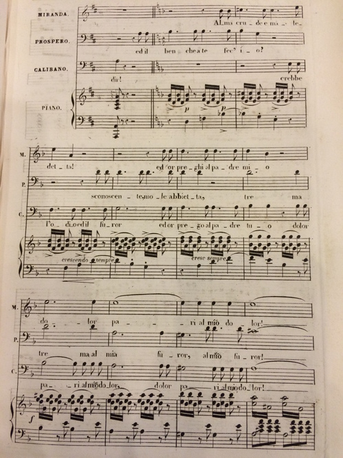
This book, however, contained the music and was put together more like sheet music instead of a play, as the previous one presents itself.

As you can see, the book contains the music as well as the corresponding lyrics. It even differentiates the parts, making it possible to easily see who is supposed to be singing. More than the previous English opera, this version moves one step further from the original through translation. Arguably, you could argue that there are two forms of translation, the first from English to French (since it’s a French publisher), and then from French to Italian. Yet, despite these changes, for translation will never be exact, we may still recognize this product as The Tempest. Yet it is not just Shakespeare’s anymore. Each translator and each composer left an artistic mark on the piece. Though the final product may be far from the original, it does mirror the mode of collaborative creation during Shakespeare’s time.